A few weeks ago, we published a piece asking whether your website is working hard enough for today's internet. Since then, a number of people have come back with a version of the same question: "what does one of these reports actually look like?".
Fair ask. We didn't want to show you a sanitised client example - confidentiality aside, there's something a bit unconvincing about a curated showcase. So we did the next best thing. We turned the audit on ourselves.
We ran bravand.com through the same framework we apply to client work. Same checklist. Same scoring. No softening.
The full example report is available to download if you want to see the detail. But here's the honest summary.
The verdict: it works. It's not working hard enough.
The executive summary writes itself, because it's what we see on client sites all the time.
Bravand.com is a well-intentioned website for an agency with genuine credentials. The personality comes through. The work cases are real. The blog is active and shows what we actually think about things. In the narrow sense of "does it function", it does.
But the site was built around who we are, not around the problems we solve. And in 2026, that's a meaningful commercial disadvantage. Search engines and AI tools answer questions - they don't surface homepages. If your content isn't structured around what people are actually looking for, you're invisible to the tools that are increasingly doing the filtering.
That's the core finding. The rest of the report is largely about the practical consequences of that structural problem.
What the scorecard showed
We rated the site across ten areas. The picture was mixed - which is useful, because it shows the kind of range you'd expect to find in any established site that hasn't had a strategic review in a while.
The good stuff - and it's genuinely good:
- Desktop PageSpeed: 98/100. LCP 1.0 seconds. Total blocking time: zero milliseconds. These are excellent numbers.
- CO2 per visit: down 89% since 2022 - from nearly 4g to 0.23g. Green hosting scoring 100/100 across all four tools we ran.
- Script weight: reduced 91% since our 2023 baseline. The code is clean.
- Brand voice: consistent, distinctive, and actually sounds like us.
These are real improvements. They're also completely absent from the website, which is its own kind of irony. We've made meaningful progress on sustainability and performance - and said nothing about it anywhere.
The areas that need work:
- Mobile PageSpeed: 71/100. Mobile LCP: 4.7 seconds. Google's threshold for "poor" is 4.0 seconds. We're in the poor band, and 53% of mobile visitors abandon a page that takes more than 3 seconds to load. That's a real conversion cost.
- AEO readiness: Poor. No FAQ content, no structured data, no schema. When AI tools are asked about digital agencies in Sheffield, we have very little indexed content to draw on. A competitor with a well-structured FAQ page gets cited instead. The fix isn't complex - but the gap is currently real.
- Image SEO: Poor. Our own "Trusted by" section had wrong company names in the alt text. CORE Economics was labelled as Togetherall. Pure Leapfrog was labelled as The Ectopic Pregnancy Trust. Screen reader users were being told the wrong organisation names. Two minutes of work to fix. It had been sitting there.
- Navigation: 30+ services in a flat dropdown, no overview page, no grouping. Related services like UX, User Experience Design, UX Build, and UX Prototyping sitting as separate items with no obvious relationship. We knew this was unwieldy. Seeing it audited confirmed it.
- Internal linking: The blog - which is genuinely the most content-rich part of the site - links to nothing. Posts don't connect to service pages. The 'Why Do We Fall?' series shows real expertise. None of it is wired to convert.
The single biggest performance fix available
The largest single asset on our site is a PNG of the team - 757 KB. It accounts for roughly 28% of total page weight and is almost certainly the primary driver of the 4.7 second mobile LCP.
Converting it to WebP at equivalent quality should bring it to around 80–120 KB. A saving of 600+ KB from one file. That single action could move us out of the "poor" mobile band.
We also found two raw Mac screenshots in the Our Work section - uncompressed, unoptimised, unrenamed, still using the filename Webflow assigned when the Mac file was dragged in. Likely 3–8 MB each.
The performance story isn't that the site is poorly built. It's that image hygiene has slipped, and the cost shows up in mobile load time.
What the prioritised recommendations look like
One of the things we wanted to demonstrate with this report is how findings get categorised. Not everything is equally urgent. Some things are a day's work. Some are fifteen minutes.
Here's a sample from across the priority tiers:
High priority, very low effort:
- Fix the wrong company names in the 'Trusted by' alt text - 5 minutes
- Fix the footer copyright date (currently shows 2012–2020, it is 2026) - 15 minutes
- Rewrite the homepage meta title and description with location, specialism, and a click prompt - an hour
High priority, medium effort:
- Compress and re-upload the team photo (757 KB confirmed - target 80–120 KB WebP)
- Add alt text to all 25 team portraits on Meet the Team
- Investigate and address the render-blocking requests (~2,480ms of mobile savings identified by PageSpeed Insights)
Medium priority, low effort:
- Add a 'Hosted on renewable energy' note to the footer - 30 minutes
- Create a /refer page and link to it from the homepage, footer, and relevant posts - our referral programme (10% of first project revenue back to you) isn't mentioned anywhere on the site beyond one paragraph mid-article
- Fix the 'identical links' accessibility issue - every 'View case study' link has the same text but goes to a different destination, which is a WCAG 2.4.4 failure and an SEO miss
Lower priority but strategically important:
- Restructure the services navigation into four or five clusters with an overview page
- Add FAQ sections and basic schema to core service pages (the fastest route to AEO readiness)
- Create a pillar page for the 'Why Do We Fall?' series, cross-linking all entries and related services
The full report runs to twelve sections and thirty-plus recommendations in a prioritised table. This is a representative sample.
Why we're sharing this
Partly because people asked. When someone is deciding whether to commission a report on their own site, it's reasonable to want to know what they're getting - not just the structure of it, but the actual texture. Does it go deep enough? Is it honest? Does it tell us things we don't already know?
We think this report answers those questions. It found things we knew about but hadn't prioritised. It found things we'd missed entirely. It put numbers on things we'd been hand-waving about. And it gave us a prioritised list of actions ranked by effort - which is the thing that actually makes a report useful rather than something you read once and file.
Partly, though, we're sharing it because the exercise of doing it was useful in itself. It's uncomfortable, looking at your own site through a client's eyes. We had the wrong company names in our alt text. Our copyright date was six years out of date. Our biggest mobile performance problem was a single PNG we hadn't thought to compress.
None of those things are catastrophic. But none of them would have been fixed without looking.
If you're considering an audit for your own site
The full example report is available to read at your own pace. It gives you a clear sense of the structure, the depth of analysis, and the format of recommendations you'd receive. Just drop us aline using the detail below to request it.
If you want to talk it through before deciding - about whether it makes sense for where you are, what it would cover, or how to build the business case internally - get in touch. No obligation. If it's not the right moment, we'll say so.
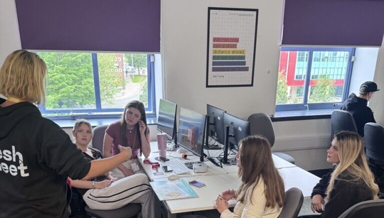
When you work with Bravand, you're also supporting Fresh Meet CIC - our social enterprise that creates paid digital internships and careers training for young people who are typically at the back of the queue for this kind of opportunity.
Also in this series
Your website might be "good". But that might be the problem...